Mobile Information Visualization

Mobile Information Visualization

A discussion.

Sandbox: Week 2

by Ramik Sadana

  1. The gestures now work instantly. Previously, a user needed to keep their fingers on the screen or a second before the system registered them as actuators. This, I had felt, helped deal with accidental contact. But it felt non intuitive, so I have brought the wait time to zero.
  2. The vertical drag for re-orienting the stacks is more smooth. The bars change color and the bars on the baseline are the sharpest.
  3. During re-orienting, the bars used to snap to the baseline.  Now, if you release the hand in the middle of dragging, the bars would snap in the direction of delta.
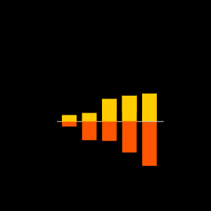
  4. The negative y axis appears. In fact, it fades in and fades out.
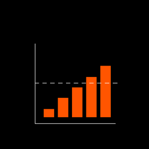
  5. The reference line works on both the x and the y axis.
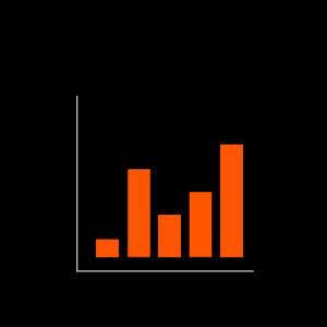
  6. Pinch and zoom works for horizontal stretch. You can pinch out to zoom in at a particular spot (precisely, the centroid of the points of touch). While zooming in, the bars which leave the region of the x – axis would disappear once the gesture ends, whereas while zooming out, the bars which enter the region of the x-axis would appear.
  7. At each gesture end, the bars reset and take up the size of the x-axis.

Sandbox: Week 1

by Ramik Sadana

I finally got cinder hooked up to the iPhone. I began building the bar chart graphic.

In the previous stage, I had prepared bar charts in the side-by-side bar form. That is useful in creating chunks and comparing within and between chunks. It also allows reformatting, e.g. four groups of three charts could be shown where each group means a quarter and each bar within a group means the year of that quarter. It can also be reformatted into three groups of four, where each group is a year and each bar represents a quarter within that year.

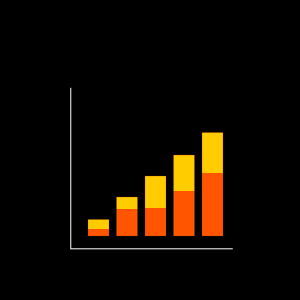
But for the mobile version, I did not want to stick to the side-by-side structure because of the space constraint. Instead, I have used the stacked bar chart form, shown in the video. The basic form of bar-chart is just a unique case of side-by-side and stacked bar charts.

There are three things happening here

  1. The chart takes data in csv format, so a data set could be ’10,20,30′. This would be represented as three separate charts covering the width of the graph. If instead data is given as ’10,20,30;30,20,10;10,10,10′, then these would be represented as three different data items over the same set of categories or the same range, and the graph would in this case be stacked.
  2. Dragging on the bar creates a reference line, and the line drags as the finger is dragged along. As the line approaches the top of a bar, it snaps to the value.
  3. In a stacked bar chart, if the vertical axis is held and dragged downwards, the chart reorients  by shifting baseline. This way the bars at level 2 and above can be grounded to zero, thus letting a direct comparison in their heights.


Bar charts: And then some

by Ramik Sadana

The requirements from the previous step led to creating a demonstration scheme for things that the mobile bar chart needed to do. Taking a cue from the research article Towards a Deeper Understanding of the Role of interaction in Information Visualization from Dr. John Stasko’s group, we have a list of interaction categories that a visualization scheme or system is expected to support. These are

  • Select: mark something as interesting
  • Explore: show me something else
  • Reconfigure: show me a different arrangement
  • Encode: show me a different representation
  • Abstract/Elaborate: show me more or less detail
  • Filter: show me something conditionally
  • Connect: show me related items

The intention is to explore the extent to which interaction of each of these types can be achieved with a bar chart.

SELECT

1. Bookmarking:


2. Reference line:

3. Bookmark reference Level:

EXPLORE

1. Zoom in:

2. Re-configure

3. Stacked barchart

4. Re-configure stacked barchart

5. Horizontal chart

ENCODE

1. Color as dimension

2. Thickness as dimension

3. Reveal patterns

 FILTER

1. Remove

2.Modify Scale

The next step from here is to start to program these interactions. Onto cinder and the sandbox.

Bar charts for mobile

by Ramik Sadana

Barcharts are going to be the first step. In among the three modes that I would like to cover by the end of the project, namely bar charts, line charts and scatter plots, bar charts seem like the right place to start since, without being too complex for the mobile medium, they would help to set up the sandbox structure well.

Bar chart has been around for longer than we can think. The first published version dates back to 1786, and comes from William Playfair’s commercial and Political Atlas. 

And obviously that was not the last of bar chart. Bar chart seems everywhere. And it is. It has become ubiquitous. (On a side note, ubiquitous computing has become ubiquitous too.) Over 200 years of using it has led us to the peak of performance with a Bar chart. It’s strange, given how much can be done with it, how little can be done to it now. Most of the new techniques don’t even feature a bar chart anymore. People say that we should leave email aside now as we seem to have achieved what we wanted to with it and there can be no more improvements to it. That is the story that seems to fit more with the bar charts. Last I read about it was in Edward Tufte’s Visual Display of Quantitative Information where he really discusses the grammar of the technique than the technique itself.

Suprisingly.. really really surprisingly.. there hasn’t been much we have seen of bar charts on a mobile phone. The argument is very basic and two sided. One. There isn’t much a bar chart does. It just grows and represents a number and there isn’t much to worry about there because a bar chart can obviously be done on a mobile. Well, not so obvious my friend. But anyways. Two. It is not the right medium. A mobile phone is too small. For anything really. Except for the big green and red buttons.

The latter argument is what my project really attempts to verify (read: nullify). I would like to work out through production of scenarios and working models whether there is a space for infoviz on mobile, or if the screen space is really too small for anything. With bar charts, it was important to figure out what had to be achieved. The goal was to find out how bar charts had been used in systems. The word systems is important because only systems offer a dynamic use of a bar chart, where it can be stacked, dragged, pulled around, etc.

And if I create a specification of goals of a bar chart, I could slowly start to implement each of them one by one.

Stages

by Ramik Sadana

An important first step here has been designing the framework for the project. I have been able to shell out tasks that I think underline the extent of the project. This has helped me understand the scope of the project better.

There are questions straight away. One big one is regarding the deliverable of the project. Should it be a working system/app which lets user import their own data and showcases them? Or should it be a library or set of functions which fits in as a third party which other projects and applications can use for the purpose of data visualization. My adviser suggests that it is the former, as it is a more achievable and real expectation from a project in this sort of time frame and also because it fits well with the expectations of the program.

Here is a list of things I would like to cover in the next some time. These are questions which define the problem space, and would help me generate the context in terms of the persona and scenario better.

  • What is hard with a mobile device?
  • What is possible with a mobile device?
  • What are the relevant things done in the past?
  • Line charts, Bar charts, Scatterplots:- Scenarios of what has been done and what is expected?
  • What interactions need to be implemented. What is permissible?
  • What technologies to use?

Hello world!

by Ramik Sadana

This blog is going to feature the developments of my Master’s project titled, ‘A Repository of Interaction Schemes for Information Visualization on Mobile Devices’